Designing for Mobile First—Jeff Batt
This guest post comes to us from Jeff Batt, founder of Learning Dojo and upcoming speaker at DevLearn 2016 Conference & Expo.
Learning is happening everywhere: on your desktop device, on your mobile device, and on tablets. How do you make sure your learning adapts to any screen size and device? Responsive design means you create your content once and it responds to the screen size of your user; it does not mean having to create two different courses for mobile and tablet. That would cause all kinds of nightmares. Every time you have to update your course, you would have to do it in two different project files.
Responsive design is standard in the web development world. Everyone expects a website to adapt to a phone size, and if it doesn’t, you know it is behind the times. eLearning is essentially a mini website. Whether you use a tool like Storyline or Captivate, when you publish it, it is a mini website using web languages. So why wouldn’t we want it to adapt and adjust to whatever device the users decide to use to consume the content?
You could build responsive content from scratch using media queries; or, one standard library for web development that makes responsive web development easier is Bootstrap (http://getbootstrap.com). Bootstrap allows you to place things inside of columns and rows that adapt to various screens, among other things, so you don’t have to program how it adapts yourself. Bootstrap is great for this but does have a lot of extra content for someone just starting out with HTML development.
There is an easier, lighter-weight library out there called Skeleton CSS (http://getskeleton.com). Skeleton still allows you to organize your content into rows and columns, which adapt to different screen sizes automatically so you don’t have to do a lot of work for how your content will look on a mobile device or desktop. You just place your content inside of the different rows and columns and assign each column a size.
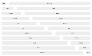
Each row has a possibility of 12 columns. If you want to have two columns and you want your first column to take up a little more room than the second column, then you could assign the first column seven of the 12 columns available and the second column could include the five left over. There are a lot of different variations you can do. See this chart:
Now what happens is, at the mobile size, your second column automatically shifts below the first column without you having to do anything in the code. Skeleton is mobile first, so it will adapt to mobile devices first then adjust to tablet and desktop from there.
Skeleton also offers some other enhancements for designing buttons and forms that look better on a mobile device. Skeleton is simple to pick up yet very powerful. It can help you design mobile-first HTML5 learning apps with ease; and, because you build those learning apps in HTML5 and CSS, it is easy to wrap your content up in a SCORM wrapper, send over xAPI statements, or even publish it to a native mobile app using Phonegap.
Take a deeper dive with Jeff on this topic at his pre-conference workshop, BYOL: Building Responsive Learning Apps with HTML5 and Skeleton CSS, at DevLearn 2016 Conference & Expo on Tuesday, November 15, in Las Vegas. Click here to learn more about DevLearn!


Leave a Reply